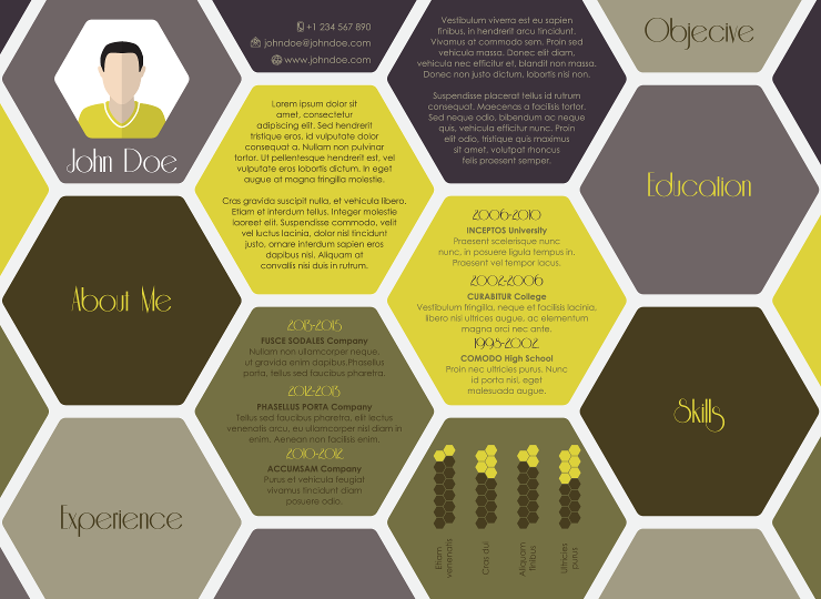
Your entry level resume won't get you the job, but a poorly formatted resume can keep you from getting the interview in the first place. Avoid these six common formatting errors:
1. Too long
Your entry level resume should be one page, no longer. If you take more than a page, you are providing too much detail. This is your resume, save the details for the interview.
2. Creative fonts
They cannot be read by applicant tracking systems (ATS), which is where most resumes end up. And many employers end up printing out your resume from the ATS, so if it wasn't read correctly in the first place, it won't print well, either.
3. Columns or other non-standard formatting:
Your resume will be stripped of formatting when it is placed into the applicant tracking system. Try saving it in text format to see how it will look to the ATS. Ugly? Then you need to use a better baseline format.
4. Too small or too large a font
Stick with 10 to 12 point fonts and use standard (Arial, Times New Roman) for best importing capabilities.
5. Margins too small
If you cannot fit your resume onto one page, don't shrink your margins to make more space. Instead, edit your content to make it more targeted. Keep your margins at 1 inch.
6. Wrong file format
Save in PDF and/or Word format for sending to an employer as an attachment; save in text format for cutting and pasting into an online form.
Sometimes the most difficult first step in developing your resume is having the proper format. We provide free resume templates for degrees from Accounting to Zoology at CollegeGrad.com. Our resumes have been praised as being the best entry level format available. And they are yours to download for free at CollegeGrad.com.


